For the sake of brevity, we’re going to dub the next generation of web app development “Web 3.0.” This entails a collection of new technologies and new ideas, which have become possible only recently with the large advances made by modern browsers.
What does this mean? This means creating web applications, not sites. We believe the server side is a web service, while the client side is the application. The server provides an API, and the client is a self-contained app which uses this API. A mobile app would be an equal citizen and use the exact same API.
We think these ideas are the future, and as we grow our team and our capabilities, we are diving into them head first. The first of these projects—and somewhat of a testbed for what our dashboard is going to become—is none other than the new Chartboost Help site.
The help site.
So without further ado, these are some of the cool new things we’re trying with the new help site:
Push State
Perhaps the first thing you will notice is that navigating the site does not involve any page refreshes. Rather, this is done through a new technology called “Push State.” It lets a web app manipulate the browser history, essentially faking navigation and inserting its own JavaScript callbacks instead of reloads.
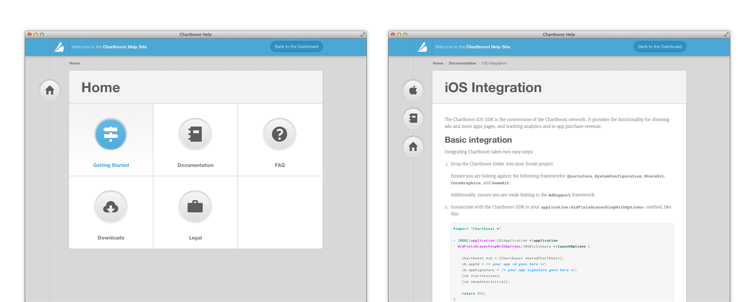
When moving between pages, the HTML is never replaced, which means that elements of the app can stay on screen, and even be animated, while the new content is being loaded. On the help site, a great example of this is the animation in the title part of the content, as well as the bouncing icons on the left.
This also makes the entire site feel more responsive and faster, since the user can be kept busy with animations, while a request to the server is happening in the background. That, and the requests are much smaller, since all that’s needed is the article content, and none of the layout or supporting files. Routing is done purely in JavaScript, and loading any URL natively from the server simply returns the same HTML file and routing code, which knows how to directly load the requested article.
JSON-API driven
This goes hand in hand with the above: now that we don’t require fully rendered HTML pages to be returned from the server, the server can now simply provide an elegant REST API. This API uses the full power of HTTP: versioning and authentication is done through headers, input is sent as JSON in the request body, and HTTP verbs are used.
Responsive
In an ever-connected world, and with the proliferation of mobile devices from smartphones to tablets, we think it’s becoming ever more important for the web to look its best on every device out there. Mobile-optimized sites just don’t cut it; a smartphone deserves to have the same full experience as a widescreen desktop computer.
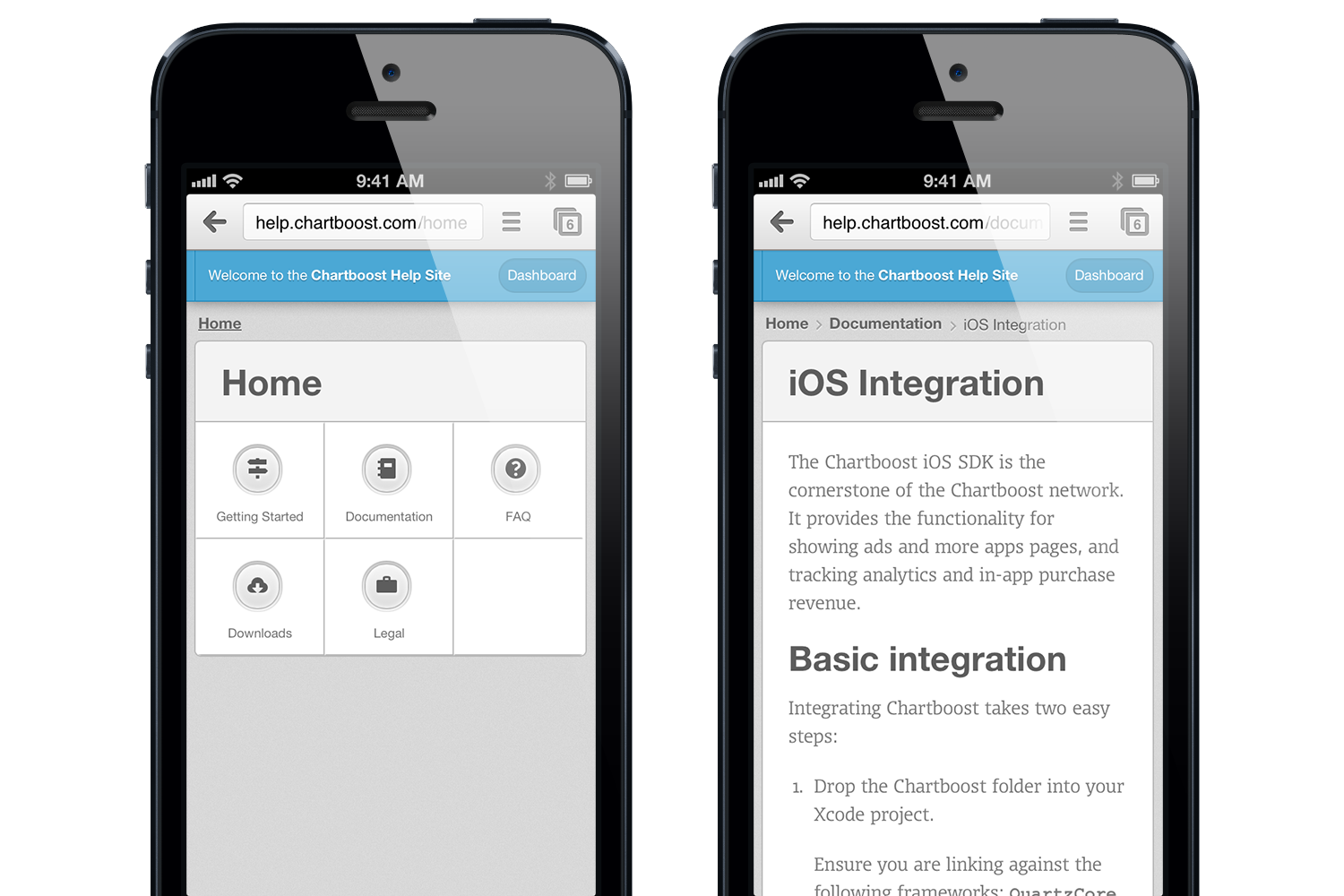
The help site, on an iPhone.
The help site, as well as this very blog, are responsive designs. They adjust and are fully functional on all devices from iPhone to Cinema Displays. To achieve that, we make use of CSS @media queries as well as rem and percent-based sizing. We used the Foundation framework for its built-in responsive grid.
Vector (Icon Fonts & CSS)
Another big recent change is the proliferation of “retina” (high-resolution) screens. They’ve been around for a while on iPhones, and are now expanding to Android devices, tablets, and computers. This is most commonly done by doubling the pixel-to-point ratio, and on iOS it is common to include double resolution assets by suffixing @2x to the image name.
We think, however, that for UI work, native rendering and vector are much better options than images. So for the help site, we use a combination of icon fonts and CSS3 properties to build up the entirety of the UI. There are practically no images in the help site’s UI!
SCSS
Another new technology we’ve made use of is CSS-preprocessing, through SCSS. This helps make our CSS code a lot cleaner and re-usable: using mixins (which are kind of like functions) for common prefixed properties, and variable dependencies on colors:
$button-green-one-textcolor : #FFFFFF;
$button-green-one-border : saturate(darken($primary-    color,11%), 1%);
$button-green-one-light-inset : #FFFFFF; /* Will be used inside an RGBA with opacity */
$button-green-bg-gradient-start : darken($primary-color, 1%);
$button-green-bg-gradient-end : saturate(lighten($primary-color, 7%), 7.5%);
You might have noticed that this blog and the new help site look similar. They actually share the same SCSS source, with only few differences, like the primary color being changes from blue to green. That, along with some other neat SCSS features like nesting allow for much cleaner and much more reusable CSS code.
Markdown
We believe the entire team should be able to write and edit help articles. Markdown is a fantastically simple markup language designed around the idea that it should look like plain text. A Markdown source file should be as readable as the output it produces; and indeed, it is far more natural to write in Markdown than HTML. Thus, our help articles are written in GitHub-flavored Markdown.
Since our documentation contains a fair amount of code samples, it was important for us to support GitHub-style code blocks, as well as native syntax highlighting. As a simple example, here is our iOS Integration article, and its source code.
GitHub
Help content, much like source code, is something that multiple people collaborate on, and which can benefit from versioning and branching. Instead of re-inventing the wheel ourselves, we decided to pick a tool we already use every day as a team: git and GitHub. The source code for all of our help articles (and its messy history) is all hosted publicly on our GitHub. Check it out! And who knows, maybe somebody will even send us a Pull Request at some point.
Design
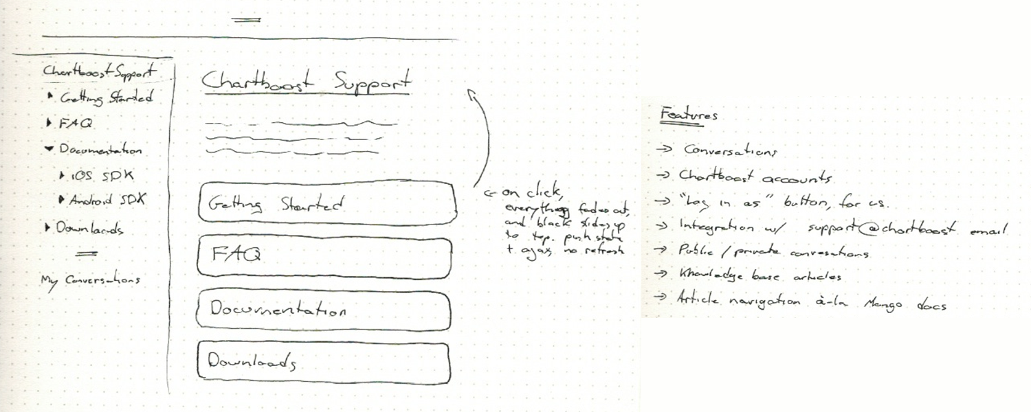
Original paper sketches
Going into it, we knew design was going to be a crucial part of this. What we had before really sucked, and was not up to our standard.

Alternate directions
We went through several iterations over a week, before settling on the current design.
We believe that the web is finally reaching a tipping point. The culmination of a decade of incremental improvements to web technologies is upon us, and lets us do things in a way that is radically new and better. If this is as exciting to you as it is to us, why don’t you throw us a line? We’re hiring!